The world of computer color is a world that is all around us, now that all virtually media has gone digital. Yet, despite having been well-established on the mass market of mainstream society for over 24 years, there are still very few people in the world that have a correct understanding of the principles of light and color in computer graphics. This article starts out with an accurate reflection of that reality, works our way up to debunk the widespread myths of the vernacular science, and finally ends at the understanding that a reasonably informed citizen probably should have. Along the way, we also take note of other principles important to professional photographers.
In the beginning of engineering time came the pros. We’re talking 1920s and earlier. In the beginning of mass-market time came the amateurs. We’re talking 1980s and later. Obviously, strength in numbers is the clear bias here, so let’s start at the era of desktop computing and web, much of which was established in the 1990s and remains largely the same to the present, albeit at a much larger scale thanks to the introduction of smartphones and tablets.
The practical hands-on amateur’s viewpoint
When playing around in your favorite computer graphics drawing program, you’ve probably seen a color picker dialog that looks something like this.
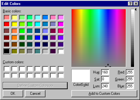
Here, you can truly see what computer color is all about. You can see that all colors are mixed from three primary colors: red, green, and blue. You mix these three colors in varying proportions to create all visible colors… or so an amateur would think.
In the midst of this, let’s also cover other related color concepts. Sure, in your computer software you mix the colors red, green, and blue, and if you look at your computer screen under a magnifying glass or beads of water on the surface of your screen, you can clearly see the red, green, blue, and sometimes white subpixels. Red, green, blue, and sometimes white (RGB/RGBW) are the primary colors used for additive color mixing, where colors are formed by adding light together. Here, it is assumed that the base color is black, which is why your computer screen must be black when it is turned off. White can be created by adding red, green, and blue together, but depending on the display technology, sometimes it is more efficient to include a specific subpixel for white.
But, if you happen to maintain your own color printer, you’ll note that it operates off cyan, magenta, yellow, and black ink. Cyan, magenta, yellow, and almost always “key” black (CMYK) are used for subtractive color mixing, where colors are formed by subtracting from existing light. Here, it is assumed that the base color is white, which is why you can only print correct colors on white paper. Again, black is included for the sake of efficiency. However, in this case, there is virtually no printing technology where mixing cyan, magenta, and yellow to form black is efficient. Technically speaking about the inks,
- cyan subtracts red but passes green and blue light,
- magenta subtracts green but passes red and blue light, and
- yellow subtracts blue but passes red and green light.
Old fashioned Western culture artists also had a dumbed down version of subtractive color based off of the red, yellow, and blue paint primaries. These three primary paints were mixed to form the secondary color paints orange, green, purple, and so on. I happened to go through an elementary school where this old fashioned culture’s technique was part of the art class curriculum. An old skool color wheel based of this system that I once made in an art class looks like this. Note that this color wheel clearly omits some important colors like cyan.
20190402/https://en.wikipedia.org/wiki/Color_wheel
20190402/https://en.wikipedia.org/wiki/RYB_color_model
Now, that was quite a bit of explanation based off of what little information you could glean from the design of a color picker dialog, investigative exploration of a computer screen, and practical maintenance knowledge of a computer printer. From the standpoint of a color professional, you’re actually off to a pretty good start in the development of your technical understanding of color. But, the devil is in the details. Beyond these rudimentary basics explained only in coarse detail, there lies a number of false conclusions ahead that can be drawn from the limited evidence.
Debunking the luminance myths
Let’s start by debunking one of the first widespread myths that emerges from such a limited practical knowledge of computer graphics: luminance.
So, when coloring a specific drawing, you’re interested in picking from a variety of shades of gray. Which gray do you pick? Well, first you just want a normal gray in the middle of the range. You see your software tells you 50% gray. Perfect! So you pick that. But, what did you really pick when you selected that 50% gray preset. If you look closely at the color dialog details, you might see that red, green, and blue are all at the value 128. Sounds reasonable: gray is naturally adding red, green, and blue together all at the same intensity, and 128 is in the middle of the available 0 - 255 range.
Now, this is where the lie is being told: 128 does not correspond to the middle of the 0 - 255 range! How is this? This is because of the application of gamma coding and gamma correction. The application of this technique has an interesting history. Originally, the motivation was simply due to the electronics of Cathode-Ray Tube (CRT) monitors: with a CRT monitor, the voltage input used to select the light intensity for display is not linearly correlated. Rather, the two are correlated by a gamma curve with a gamma value of 2.2:
LI = Linear Light Intensity, range 0.0 - 1.0
GIV = Gamma Input Voltage, range 0.0 - 1.0
y = Gamma = 2.2

LI = GIV^y
LI = GIV^2.2
20190402/https://en.wikipedia.org/wiki/Gamma_correction
20190402/https://en.wikipedia.org/wiki/File:SRGB_gamma.svg
The original mass market application of CRT monitors was for black-and-white analog television display. For this traditional use case, analog television signal is simply the stream of analog gamma input voltages to send to the CRT monitor while the beam is scanning across the surface of the screen. Upon detailed study of the scientific operation of television sets, it was confirmed that the human eye also has a perceptual gamma-response curve to light intensity, so in fact this method of encoding and transmitting image intensities was ideal.
Entering the computer era, CRT television sets were quickly repurposed into computer monitors. Monochrome black-and-white display was very easy to build, but then came along the desire to display grayscale. How do you do this? Simple, just build a digital-to-analog (DAC) converter to convert a stream of digital, 8-bit unsigned integers to the voltages required to drive the CRT. With color, the CRT had three electron guns, so simply add two more DACs for three-color RGB digital display control.
LI = Linear Light Intensity, range 0.0 - 1.0
GCIS = Gamma-Coded Image Sample, range 0 - 255
y = Gamma = 2.2

LI = (GCIS/255)^2.2
Please note that on historic Macintosh computers, rather than passing the signal intensity output directly to the CRT monitor, they used gamma correction in between to convert the effective encoding to a gamma = 1.8 curve, so there are exceptions and variations to the gamma value on some historic systems. However, modern systems have all standardized to gamma = 2.2.
What about the transition to LCD monitors? Well, given the benefits that have been confirmed with gamma coding, there was no way that LCD monitor manufacturers would try to change things just because their monitors didn’t have a gamma-response curve like CRTs, so gamma coding stuck around and is now a de facto standard. More specifically, the name of the standard is sRGB, in which the transformation curve is a little bit more complicated than a simple 2.2 gamma curve, but virtually the same at a high-level.
20190402/https://en.wikipedia.org/wiki/SRGB
Technically speaking, the problem is due to a confusion between luminance and luma. Luma is the coded value for luminance. It cannot be compared in a linear fashion, and it should not be. Rather, the only correct understanding is that its scale is in steps of perceptual sensitivity, and humans perceive light on a gamma scale. Light in the physical world operates on a linear scale, however. So, computing fractional light intensities directly on luma values is physically inaccurate, and clearly from a perceptual standpoint appears to be incorrect.
Operating on gamma-correct images is very important and fundamental for virtually all image editing operations. Resizing, rotating, color levels, transparency, and blending are a few examples. None of these simple image manipulations can be done correctly if they are not done in linear intensity image samples. Yet, in spite of the fact that I have just said that, the most popular computer software over the past few decades have always done image scaling on gamma-coded image samples, which results in incorrect and artificially dark images.
Likewise, defective, gamma-incorrect blending has been officially standardized in the Scalable Vector Graphics (SVG) web specification, even though earlier mass market software like Microsoft Office had always used gamma-correct color blending. So, gamma incorrect color blending is here with us to stay. If you want gamma-correct color blends on the web, you need to build your own multi-stop gradients for a piecewise approximation of a non-linear function.

Check out this great old article for more information about the state of affairs in gamma-incorrect mass-market image editing software, and also a great cross-section of what various related professionals have to say about the state of affairs. Despite its age, it is still relevant today in 2019.
20190402/http://www.ericbrasseur.org/gamma.html
20190402/http://www.ericbrasseur.org/gamma-1.0-or-2.2.png
Native image sensor curves
A final note that is worth mention: image sensors. Historic CRT video
camera tubes and photomultiplier tubes in early digital scanners had a
gamma-response curve, so no correction was needed for the purpose of
display on CRT monitors. However, modern CCD and CMOS image sensors
have a linear response, so gamma correction to sRGB is required for
proper display. Interestingly, although the response curve of CCD and
CMOS image sensors is linear, camera manufacturers have each developed
their own creative conversion curves when converting from RAW camera
data to JPEG image data, which turn out not to be strict gamma curves.
Digital darkroom software like darktable has built-in logic to
handle this phenomenon. That being said, if you are working with a
random JPEG image, rather than assuming it is gamma-correct, you
should see if you can shoot a calibration photo from the same camera
to determine if any conversion curves are needed to get a more
physically-accurate image.
Why are such errors prevalent in mass-market software?
Yet, all of this technical background is nigh-unheard of upon the average, amateur, practical, hands-on computer user. But, you may still be wondering. How did this mishap slip into the mass market computer software that was written by professional software developers? Now, this is where I must remind you that these “professional” software developers are not as high in the sky as you may think. The most popular computer software that penetrated the mass market most deeply is written by programmers who are very average, amateur, practical, and hands-on. They have to be, otherwise the software would not have been cost-competitive for the mass market. Not too long ago, they too were just another amateur computer user.
In particular, the company Microsoft as observed in the 1990s was comprised out of a very large number of programmers who first learned computer programming on a tiny 1980s 8-bit PC microcomputer at home, sometimes as early as 4 years of age. These computers were long and far away from the computers we use every day today. Some of them didn’t have graphics display capabilities, and those that could display graphics could not display full photographic color, or even a full range of shades of gray. By the time they were professionally employed by Microsoft, most of them have never had college education in the specialty of print, film, or television color reproduction standards and technologies. And why would they? For as long as they’ve ever known computers, the mass market computer was only capable of displaying a small handful of colors. Their practical programming skills were far more valuable than any theoretic treatment of high art, high color reproduction technologies that could not be applied to the then-nascent mass market computer graphics technology.
To be punctual, the point is this: It is a necessary evil that those people who bring forth the new economy’s technology to the mass market that we know of it as today, as quickly as they have brought it forth, would not and could not be skilled in the full theory of the technology they were working with. They were literally playing with fire, and out of their unskilled craft with dangerous consequences to the fidelity of computer user’s data, they were compensated graciously, if only for the sake of at least bringing something within the reach of the mass market. How else could those tiny so-called professional media societies be capable of leading this much growth? Tongue-in-cheek, computer users of the 1990s have joked that the solution any software problem on Windows is to reboot, and a similar sentiment carries on to modern mass-market Android smartphones of today: if your phone stops working, buy a new one.
The likes of your fancy nancy CIE and SMPTE society of television engineering professionals did a great job at their color television engineering for the rich, for the few and the proud “who’s-who” in American neighborhoods where the vast majority of other households still used black-and-white television sets. The PC computer graphics culture reflects the people who had successfully broken free of this outdated culture that assumes only the rich see full color television, or even any television at all.
Okay, but what about software that has been around for many decades like Microsoft Office? Why has this been a problem for so long? Well, after the fact when you had the practical hands-on software developers finish their job, you’re left with a big company with politics and management. It is very easy for a company full of average, non-technical, pragmatic, abstract-thinking managers to not notice such a technical error and steer people away from correcting such a minor technical error.
Debunking the color hue myths
Okay, let’s debunk the next myth: Math and logic on color hues.
First of all, let’s state a clear fact. If you have a cheap screen, the rainbow-like range of colors you see in a color picker dialog does, in fact, represent the full range of color hues that your computer screen is capable of displaying. At first sight in the hands of an amateur, this range and selection of colors is clearly greater than anything you may have previously been able to achieve with a primitive physical school paint palette. However, over a few years of computer use, it is also clearly apparent from the viewpoint of an amateur that some monitors are capable of displaying more vivid color hues than others. The breadth of hues a certain display device or image reproduction technique is capable of achieving is referred to as the color gamut. Just remember, however, that due to our previous discussion on gamma correction, chances are you are not looking at that range of color hues on linear scale.
N.B. From the standpoint of a computer graphics professional moving back and forth across many different computer screens, they find it really annoying that some cheap screens are physically incapable of reproducing your hard-earned work in its full glory.
So, about about the breadth of color gamut. What exactly is the ne ultra ideal limit on color gamut? The limit on color gamut is the limit of what you can see when incandescent light is dispersed by a prism into a color spectrum. A typical prism spectrum display may not appear to have as vivid colors as you can easily create on a computer screen, but if you do happen to catch sight of an ideal prism spectrum display, remember, that is the full range of all colors that you can see.

20190402/https://en.wikipedia.org/wiki/Prism
PLEASE NOTE: The previous photo shows the spectrum of a mercury-vapor lamp. I should replace that photo with one of an incandescent spectrum.
Also, remember our tendency to refer to a color spectrum as “rainbow-like.” Indeed, it is exactly that: a rainbow is like a color spectrum, but clearly it is a less clear and lower fidelity display of colors, as many of us know from the difficulty of spotting a rainbow in the sky first-hand.

Indeed, the colors generally do appear more vivid than your typical rainbow or prism spectrum display.
Fact: A prism spectrum does show all of the most vivid of hues that is visible to human vision.
- Myth: Linear scale of colors, prism spectrum, rainbow, and computer display are all the same.
- Myth: You can form all colors using red, green, and blue.
A computer screen does not display a full spectrum of colors, nor does it cover the full range of human color vision.
Matter of fact, this should be self-apparent from the previous discussion to an experienced amateur who has seen the difference is color gamut across screens. But, because this is not readily apparent to the newest of amateurs, it is an enduring myth.
20190402/https://en.wikipedia.org/wiki/Rainbow
20190402/https://en.wikipedia.org/wiki/File:Double-alaskan-rainbow.jpg
20190402/https://en.wikipedia.org/wiki/Spectrum
20190402/https://en.wikipedia.org/wiki/File:EM_Spectrum_Properties_edit.svg
20190402/https://en.wikipedia.org/wiki/File:Rainbow_above_Kaviskis_Lake,_Lithuania.jpg
Myth: Human vision has three cone types, red, green, and blue light.
It is true that there are three cone types, but they have rather large spectral perception ranges. The three cones are the L cones, M cones, and S cones, for long, medium, and short wavelengths respectively. Each of these cones has a spectral response curve and limits on which wavelengths they are sensitive to. Please note, however, that there is no “one size fits all” sensitivity curve because the exact composition of the pigments in the cones varies from person to person, not to mention that some people are colorblind. However, the experimentally determined values represent an average case that is fairly accurate for most people.

20190402/https://en.wikipedia.org/wiki/LMS_color_space
20190402/https://en.wikipedia.org/wiki/File:Cones_SMJ2_E.svg
20190402/https://en.wikipedia.org/wiki/Cone_cell
20190402/https://en.wikipedia.org/wiki/Rod_cell
If you could choose three pure spectral colors that independently and strictly affect only one of each of the L cones, M cones, and S cones, then indeed you could cover the whole of human color vision using only three colors. But if you look at the LMS spectrum sensitivity plots, you will see that this is not possible. However, you can get pretty close by picking spectral values that have a proportionally strong effect in one type of cone and only weak effects in the other types of cones. Unfortunately, this comes at the cost of needing to select a red color that is far away from the peak of the L cones’ sensitivity, and it’s not possible to pick a spectral value that affects the M cones nearly exclusively due to its spectral response similarity to the L cones. Rather, the best you can do for the M cones is to pick a value that proportionally affects the M cones the strongest, and also has a considerable affect on the L cones. This is why red, green, and blue cannot be mixed to form all colors.
A very simple and coarse way to remember spectral wavelengths similar to those used for pure spectral color primaries: 650 nm red, 550 nm green, 450 nm blue.
Over the decades, various different standards were developed that specified which spectral wavelengths to use for color primaries in film and television. One of the major considerations between the choices was cost. Here are some Wikipedia articles on the various standards and related subjects for reference.
20190402/https://en.wikipedia.org/wiki/Gamut
20190402/https://en.wikipedia.org/wiki/File:Rechteckspektrum_sRGB.svg
20190402/https://en.wikipedia.org/wiki/Mach_band
20190402/https://en.wikipedia.org/wiki/Twisted_nematic_field_effect
20190402/https://en.wikipedia.org/wiki/In_Plane_Switching
20190402/https://en.wikipedia.org/wiki/DCI-P3
20190402/https://en.wikipedia.org/wiki/Rec._2020
20190402/https://en.wikipedia.org/wiki/Rec._2100
20190402/https://en.wikipedia.org/wiki/Wide_color_gamut
20190402/https://en.wikipedia.org/wiki/CIE_1931_color_space
20190402/https://en.wikipedia.org/wiki/File:CIE_1931_XYZ_Color_Matching_Functions.svg
20190402/https://en.wikipedia.org/wiki/SRGB
20190402/https://en.wikipedia.org/wiki/File:CIE1931xy_gamut_comparison.svg
20190402/https://en.wikipedia.org/wiki/Rec._709
20190402/https://en.wikipedia.org/wiki/File:CIExy1931_Rec_709.svg
20190402/https://en.wikipedia.org/wiki/Rec._601
20190402/https://en.wikipedia.org/wiki/NTSC
Constructing a more accurate computer color spectrum
Now, let’s try to discuss a simple and approximate means of linearly visualizing spectral colors on a computer screen. Of course, the only way to do a totally correct visualization is to convert from the data of the experimentally determined LMS curves directly, taking into consideration what the actual spectral color primaries of your display are.
Although the curves are bell-shaped, they’re linear over most of their range. The low ends are easy to give a non-linear effect by simply trailing linear interpolation of gamma-coded values. The curved upper ends naturally have less precision (due to human vision gamma response), so you need not worry too much about them. Green has a stronger spectral response than red and blue, which are about the same, i.e. at same amplitude. So, you need to be able to define perceived color brightness separately from physical brightness.
The strong contribution of L in green means that you need to back it out faster than you’d normally expect. Also, it must stay high for longer, say for 75% of its region of affect, after which point it backs out quickly to zero.
Because of these considerations, straight line linear intensity changes work pretty well. Now it’s just a crude approximation, but better than gamma curve which kind of makes yellow look like an artificially sharp line, because, quite literally, it is. Give it a curve in the other direction. on the way down (or how about two segments), and that looks better, and is in fact more realistic. Give green a little bit of a flat island too, or else trim this and do without a curve for red. On the other hand, the story from green to blue is quite accurate if you use a strict linear blend, at least past 0.5. A gamma blend at the lowest intensity edges is most realistic. Finally, you simply add a linear amount of red back to get the correct purplish hue at the edge. The last blend from purple to red can simply be done linearly, as these are non-spectral colors.
Base "computer color" spectrum gradient stop points:
R Y      G      C  B      M      R
0 16.667 33.333 50 66.667 83.333 100

For the sake of simplicity, we'll use a simple gamma translation
function, rather than the full sRGB formula.  It's close enough for
our purposes of creating more physically accurate linear light
intensity gradients.

LI = Linear Light Intensity, range 0.0 - 1.0
GCIS = Gamma-Coded Image Sample, range 0 - 255

LI = (GCIS/255)^2.2

GCIS = LI^(1/2.2) * 255
GCIS = LI^0.45 * 255

Now we compute key gradient stop points that are required so that we
can get a reasonably accurate linear intensity spectrum even when
gamma-incorrect interpolation is being used, i.e. as is the case in
SVG.

(0.000 ^ (1/2.2)) * 255 =   0
(0.125 ^ (1/2.2)) * 255 =  99
(0.250 ^ (1/2.2)) * 255 = 136
(0.375 ^ (1/2.2)) * 255 = 163
(0.500 ^ (1/2.2)) * 255 = 186
(0.625 ^ (1/2.2)) * 255 = 206
(0.750 ^ (1/2.2)) * 255 = 224
(0.875 ^ (1/2.2)) * 255 = 240
(1.000 ^ (1/2.2)) * 255 = 255

And we need a little bit more precision to handle our red-orange-green
dynamics.

(0.9375 ^ (1/2.2)) * 255 = 248
Note the original LMS data (from the research papers linked in the Wikipedia article) measures in log space, and the original graphs are nearly parabolas. Graphed in linear space, the effect is nearly a Gaussian curve. So, we know this data is correct without an improper gamma or log interpretation.
Speaking of gamma, it’s very important to do gamma-correct color blending, otherwise you end up changing the hues of the colors in unintended ways during the course of the blend.
Now, were we to adjust this for perceived brightness, basically we just weight green to 60% of full intensity (on a linear scale, of course), while we keep red and blue as-is. Be careful about performing any calculations that require linear, physical light intensities on a spectrum that looks like this! If you see this, you must ascertain whether the encoded brightness is physical brightness or perceived brightness, and convert from perceived brightness to physical brightness before you perform subsequent calculations.
So, as we can see, the main benefit of linearizing these color combinations to a spectral scale is that we have more headroom to select our oranges and yellows. Second comes a little more headroom for selecting turquoises and purples. Obviously, these are important user interface improvements for selecting color. Had it been otherwise, I would have recommended the default method of showing a computer hue spectrum.
And seriously, I can’t help but admit this as a side comment. Why is human color vision so sensitive to oranges, yellows, and greens? That’s how you tell if fruit is ripe! The only reason why berry picking and fruit picking is touted as such as “low skill” among human society is because humans have evolved to be so good at it! As for those people who are colorblind, well they have the advantage that they are less susceptible to being fooled by camouflage, so they’re the ones who are the hunters in society. And it makes sense that colorblind people are a relative minority, because fruit is larger in the food pyramid than protein, so more work needs to be done with fruit than with meat. Either that, or they’re the ones that always win against the color-sighted people when playing first-person shooter games where everything is all camouflaged and hard for color-sighted people to see.
Debunking the saturation myths
Okay, so I’ve debunked myths about hue and luminance, but I haven’t yet covered saturation. But, don’t worry. A physically correct understanding of the concept is easy. Simply put, how much white light do you mix with your pure spectral color?
To be honest, there aren’t really any major myths around color saturation. This is by far the best understood aspect of computer graphics. The only main stubling point is the common one, of course: gamma-correct color mixing.
A pure hue will only have non-zero intensity values for two out of three of the component colors. If there is a non-zero value for all three colors, then you can determine the amount of white light simply by measuring the linear light intensity of smallest the component value. After subtracting this “common-mode” value from all three linear components, you’re left with the linear component color representation of a perceived pure spectral color (unless it is in the magenta region, of course).
The main question with saturation how to calculate the specific numeric value. In the case of the white light component, the physical brightness can be used as-is.
Things are harder with the “pure spectral” component. The truth is, with RGB colors, you never know if the source light was a pure spectral color or a component mixture of colors, so for simplicity, you might as well assume either (1) it is a component mixture of the color primaries or (2) it is a pure spectral color. Saturation computations almost exclusively use assumption #2. Assumptions similar to #1 are mainly of interest for raytracing engines, for example.
With our second assumption, the RGB component color values indicate the perceptual brightness of a pure spectral color. We should then convert that to a linear physical brightness. Then, saturation value computation is easy:
saturation = white / (white + spectral)
In practice, mass-market software is more similar to calculating saturation as a fraction of the perceived brightness of the white light to the total perceived brightness. Also, the perceived brightness of a pure spectral color is calculated by a very simple method: it is simply the peak component brightness, and the maximum brightness of a pure spectral color is 50%. White light has a maximum 100% brightness. This allows luminosity of a single color to be shown on a scale where 0% is pitch black, 50% is the pure hue, and 100% is pure white.
At face value, this actually a perfectly acceptable representation. Unfortunately, the mixing computations are also done on gamma-coded values, which is mathematically incorrect. Fortunately, the error margins here are much smaller than is the case with the other erroneous computations.
Desaturation filters
The primary myth that lies in the color saturation is not the concept per se, but the methods and motivations for adjustments. Want to wash out the colors in a picture? Sure, that’s easy, just blend with white. Linearly, of course! There may also be a multiplication for adjusting intensity. But what if you want to do the opposite, to enrich the color hues?
So, the first answer, and most natural method to try. Just subtract white. Since we’re talking linearly, assuming that the previous method caused no overshoot, a subtract is fully commutative and reversible, as long as it also doesn’t cause undershoot.
Should you saturate by using constant values for entire picture, or proportional per pixel? If you’re talking about the limitations of a computer capture or reproduction system, you should use constant values for the entire picture. The problem with subtracting a constant value everywhere is that you may cause some areas to undershoot. This is where it is smart to use a desaturation brush. Control only the areas of the photo that need it, in specific regions.
The per-pixel manipulation is only grounded in physical science so far as computer capture and display systems are limited in their color gamut. However, there’s another important case were such manipulation is also valid: dynamic eye adaptation. You can argue that for dim areas o the image, there’s not going to be very much color fidelity, but for bright areas of the image, there’s going to be a lot more color fidelity. So this is where proportional per-pixel adjustment can make sense. The dark areas are necessarily left washed out in color, but the bright areas get a more aggressive treatment for improving hues. And to preserve highlights, that can be kept within a limit. Otherwise, beyond this, per-pixel manipulation is purely an artistic effect that is not based on physical manipulation.
Non-physical manipulation is probably not what you want in general. As a human in a non-computerized world, your manipulation of what you see is largely on a ohysical realm. When it comes to adjusting the opening of your window shades, close them halfway, closing the shades completely and using a concentrated artificial spotlight on your object of interest, getting closer or further away from text to read, rotating a paper around so that it is easier to read, you get the idea. All of these manipulations are linear, physical manipulations. Humans don’t have an everyday concept of per-pixel transformation filters, so as an amateur user, you probably want to leave these as your last resort.
Yes, as you may have realized, what is the way to brighten up the apparent hues of colors in theater? Cover all the windows, turn off the house lights, and shine the spotlight only on the staged subjects of the theater, leaving the rest of the theater auditorium darkened. Again, we’re talking purely physical, linear manipulations, no nifty per-pixel digital signal processing filters.
Convert to grayscale
Another consideration with the concept of saturation is convert to grayscale. You can do this by perceived brightness or physical panchromatic brightness, the latter in which case you simply convert to linear (of course!), add the brightnesses, divide by three, and convert to gamma, if you assume a component light source! The big problem here, of course, is that in general, you don’t know for sure whether you are looking at a pure spectral color or a component-combined color. In some specific circumstances where there is excellent knowledge of the underlying physical environment such as raytracing, you can know for sure whether you are working with pure spectral colors that come directly from light sources and primary illumination or combined components from “color bleeding.”
Otherwise, for perceived brightness to grayscale, you determine the spectral color, use that to compute its linear luminosity, and convert to gamma to get your grayscale color.
A final easy case, though hardly ever used in practice, is convert to orthochromatic grayscale. This is simply taking only the blue channel intensities and using those for all channels. (Possibly, you might consider emulating weak sensitivity for green and red.) This mirrors the behavior of orthochromatic black and white photographic film, and likewise, the reason it is seldom used is because it produced quite inaccurate depictions of human faces.
20190907/https://en.wikipedia.org/wiki/Panchromatic_film
LED color mixing
Sometimes RGB LED color mixing is touted as being entirely different from standard web color mixing, but actually this is not quite the case. All of the fundamental principles apply essentially the same, it’s just that the specifics are different. Namely, the black point is generally assumed to be much higher in LED color mixing than is the case for computer screen and computer print color mixing. Because of this, there is a limited range of colors that can be displayed, and in particular, low-luminosity colors that are less than the black point’s intensity cannot be displayed at all. A common example given is that brown cannot be displayed via LED color mixing. Indeed, in technical terms, brown is simply dark orange. This means that if you want brown in LED color mixing, chances are that the best you may be able to get is an orange.
If total room lighting is controlled to have a very low amount of ambient light, then it is, in fact, technically possible to display brown via LED color mixing. The main implication here is that you must also have a comparatively high white point for reference, otherwise your brown will again simply appear to be an orange.
Also, the principles of gamma correction are also still in full force. LEDs technically have a non-linear light intensity output curve that varies with temperature, but in abstract, the curve is approximately linear, not a gamma curve. This means that if you want users to be able to choose an HTML color value when programming the LED, you must convert from the sRGB gamma curve to a linear scale when driving the LEDs to display the given color.
Artificial lighting and color saturation
The perception of color saturation plays an important role in artificial lighting. If you haven’t picked it up from what I’ve mentioned previously, it is a fact that humans can perceive “white” light without needing a full spectral illuminant. Not only this, but the perceived luminosity of the light can be exactly identical to a spectral illuminant if the wavelengths of the components are chosen properly. If you can generate artificial lighting over only a subset of all visible light wavelengths, but it results in the same perceptual brightness, that’s a lot of energy and money you can save. Indeed, this is one of the principal techniques used to save energy in fluorescent and LED lighting, in addition to not generating light in invisible light wavelengths like infrared.
Unfortunately, agressive use of this technique results in reducvd color rendering index (CRI). The truth is, when you are working with artificial lighting, there are many object surfaces of which you do not and cannot know the exact range of spectral reflections. If your “frequency bands” of artificial light are not at the peak reflection wavelengths of the objects in question, their colors are going to look weird, inaccurate, and outright incorrect. The only remedy for this is to use a more spectral illuminant, which means you must project light over more wavelengths and pay for that additional energy cost. So you can’t get everything for free.
20190907/https://en.wikipedia.org/wiki/Color_rendering_index
Now, if we lived our entire life of artificially printed papers that require artificial lighting through screens, this would be much less of a problem and we could save a heck of a lot of energy. But that’s a long ways away off into the future, when going paperless becomes much more mainstream in society.
In the natural environments that are habitable to humans, the major natural light sources are spectral illuminants: the sun and fires. Black-body radiation is the name given to objects that emit a light spectrum determined primarily by the temperature of the object and no other chemical properties. An incandescent light is one of the few modern sources of artificial light that have a black-body radiation emission spectrum.
20190907/https://en.wikipedia.org/wiki/Black-body_radiation
Conclusion
Since the start of film and television, we’ve certainly come a long ways in democratizing access to advanced media technologies, and computers have been at the forefront of this. Alas, there remains the eternal skills gap between what are technology is capable of versus what the layperson understands. For lack of better education, over 99% of the world holds the common misconceptions, and chances are this is going to be exactly the same for the next 20 years or so.
Meanwhile, the film industry and “triple-A” video game industry is racing forward with stereoscopic 3D, high dynamic range, wide color gammut, ultra high definition, 360 degree panorama video, and other highly advanced technologies. All of this is happening while the amateur computer user still barely understands the basics.
The bigger point being called into question, though, is this: Beyond
higher resolution, is there really any value to end customers for all
these advancements? Chances are the answer is “no,” because despite
increasing operating system support for wide color gamut and high
dynamic range, it doesn’t look like web developers are going to pick
up the new tech any time soon. 24-bit HTML colors of the form
#f0f0f0 are so popular that any change to the “standard” is going to
be met with a lot of resis. It’s hard to see how the average web
developer is going to switch from a 24-bit HTML colors of the form
#f0f0f0 to 48-bit wide color gamut when cartoonish flat design is in
the vogue of web development, especially due to the fact that it saves
bandwidth and causes websites to load faster. Right now, any
increases in page loading speed are going to be far more desirable
than increases in graphics glitz beyond what was possible with 24-bit
sRGB color.
By all means, I hope this is a great article for those coming from the beginner’s starting point and wishing to work upward to the pros. A universally grounded scientific basis is a good starting point to build off of.